The Basis of Flexbox
If you have worked with CSS (Cascading Style Sheets) for any length of time, you have likely had to spend some time laying out your web page. When CSS was first designed, it was built to support the structure of HTML. This means the page content should (and would) flow...

If you have worked with CSS (Cascading Style Sheets) for any length of time, you have likely had to spend some time laying out your web page. When CSS was first designed, it was built to support the structure of HTML. This means the page content should (and would) flow in the same way a news article or book flows: left-to-right, top-to-bottom.
Over time, CSS has been updated to allow for more unique layouts, using new properties and features such as position and media queries. The web has become much, much more than just a medium for reading, so support for any type of page layout is becoming more and more of a necessity.
Fortunately, there is now Flexbox. While flexbox is most helpful in small screen and mobile device settings, it can also be very beneficial in the desktop browser space. For a more desktop-geared layout concept, take a look at the CSS Grid Layout. It has almost non-existent support in current browsers but is starting to gain support in future Chrome, Firefox, and Opera releases. There is also a nice guide for it on CSS Tricks. In the meantime, it may be best to stick with flexbox.
Some of the interesting features of flexbox include:
- Flexible size - allow content to resize itself based on given parameters
- Alignment - vertical alignment. Enough said.
- Flow direction - allow your content to display left-to-right, top-to-bottom, right-to-left, or bottom-to-top
- Wrapping - easy, customizable wrapping of content
There are plenty of resources around the web for flexbox, but, as the flexbox spec has changed quite a bit since its inception, many are outdated. One of the better resources I’ve used for learning about flexbox is Chris Coyier’s CSS Tricks Guide. There is also a nice sandbox if you need to quickly test configurations. Since Flexbox is fairly new, it may not be fully supported in your browser, though most modern browsers do fully support it.
With the above resources, I won’t go into detail about all the features of Flexbox. Instead, I’ll dive deeper into how one of the core components of flexbox works --- flex-basis, as it took me a bit to really wrap my head around. It acts a little differently than width does, but fills a similar purpose:
How wide (or tall, if using a column direction) should my content items be?
width is a hard value that doesn’t adjust: 200px width will give you a 200px-wide element; 10% width will give you an element 10% the width of its parent.
flex-basis is different in that it takes the available space for the items, removes any space taken by the items’ non-base widths (margin, plus padding and border if border-box is not specified), and distributes it amongst the items based on their flex-basis, then flex-grow properties.
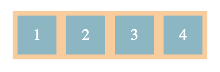
Basic Example
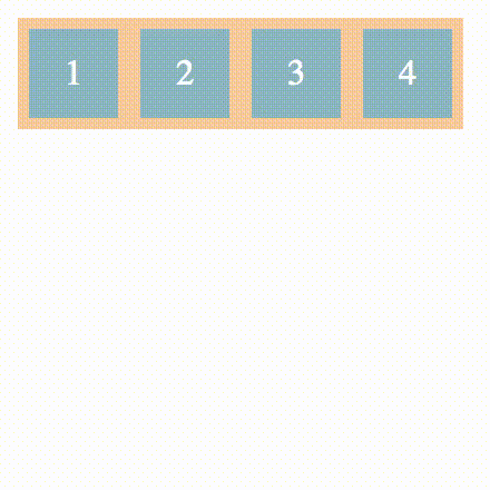
- If a container has:
- 4 children
- width: 200px
- and each child has:
- flex-basis: 40px
- margin: 5px
- then the items would fit perfectly in the 200px space.
- (40px + 5px + 5px) \* 4 items = 200px
- If the container grows and the items have a flex-grow value greater than 0, the 40px width of the items will also grow.
- If the container shrinks, the items will do one of the following:
- shrink if flex-wrap is set to nowrap and items have a flex-shrink greater than 0
- overflow the container if flex-wrap is set to nowrap (this will also occur in the above scenario once items have shrunk to minimum width)
- wrap if flex-wrap is set to wrap, then grow depending on the flex-grow attribute
margin is not included in the flex-basis value
When setting the flex-basis of items, be aware that the margin is not included in that value. This means that if you have 4 items at 25% flex-basis, and a 10px margin, they will either wrap or get pushed outside the container. This is also the case with border and padding unless you set box-sizing: border-box.
flex-basis is taken into account before flex-grow
What this means is that, given:
- A container of:
- width: 560px
- 5 children
- and children with:
- margin: 0
- flex-basis: 100px
- flex-grow: 1 except the last child with flex-grow: 2
then the calculated widths of the children will be:
- 110px
- 110px
- 110px
- 110px
- 120px
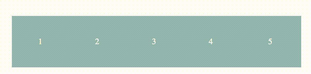
The calculation steps are as follows:
- Take the available space: 560px
- Divide it by the flex-basis: 100px
- This gives us a maximum of 5 (complete) children, which we have
- If we had only 4 children, then we would only take up 400px.
- There is now 60px left of space to distribute amongst the 5 children
- Total all of the flex-grow values together:
- 4x1 + 1x2 = 6
- Divide the leftover space by the total flex-grow value:
- 60px / 6 = 10px
- For each child, multiply its flex-grow value by the previous value:
- 1 * 10px = 10px
- 1 * 10px = 10px
- 1 * 10px = 10px
- 1 * 10px = 10px
- 2 * 10px = 20px
- Add these values to the flex-basis for each respective child. This is the width for the child:
- 100px + 10px = 110px
- 100px + 10px = 110px
- 100px + 10px = 110px
- 100px + 10px = 110px
- 100px + 20px = 120px
Hopefully this helps you with any problems or hangups you may have with Flexbox's flex-basis property. It's definitely a different way of thinking about defining widths, but some complexity is necessary to achieve the dynamic, flexible nature of modern web content.